The Bunkered Podcast
Brand Refresh
Brand Refresh
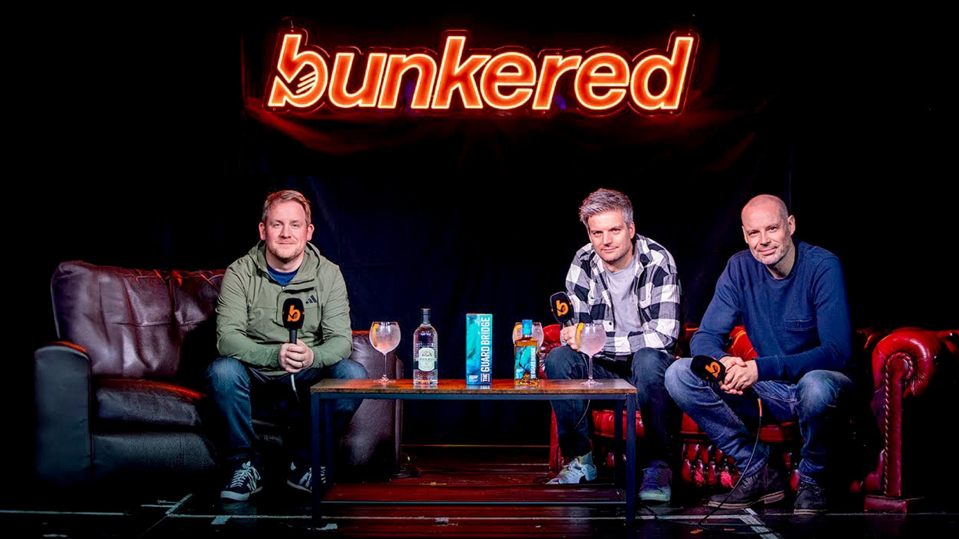
Since it launched in August 2020, The Bunkered Podcast has firmly established itself as the number one golf media podcast in the UK, attracting a loyal and fast-growing fanbase in the process. It has featured guest appearances from some of the biggest names in the game, racking up listeners in more than 150 countries.
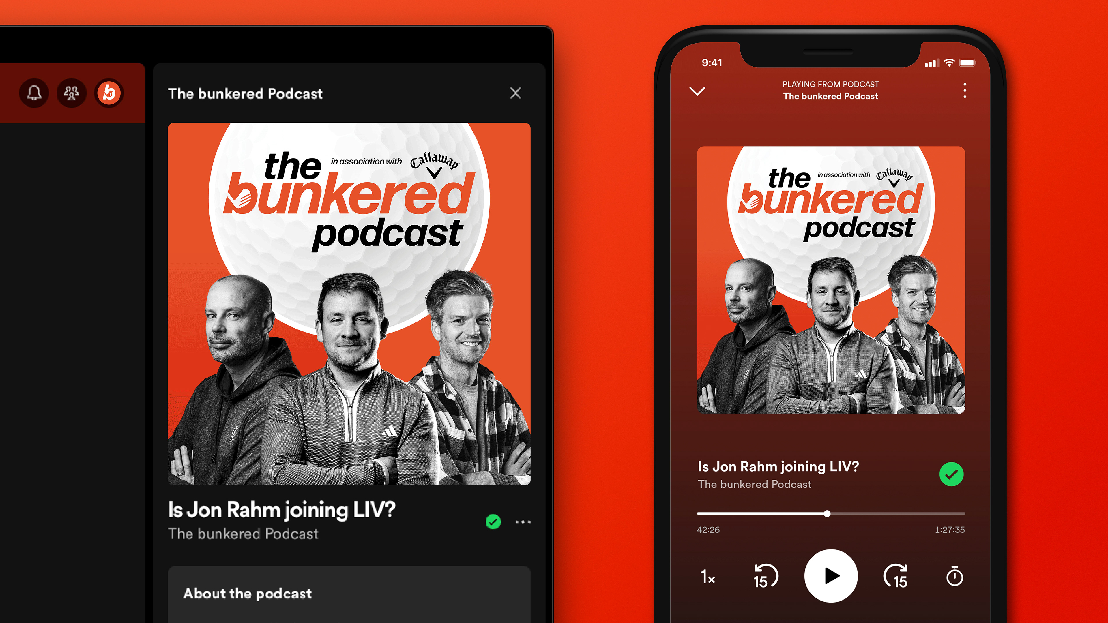
I was tasked with refining the visual identity, establishing a hierarchy and creating more standout on streaming platforms, bringing the design more in line with the bold, editorial style of the magazine.
I was tasked with refining the visual identity, establishing a hierarchy and creating more standout on streaming platforms, bringing the design more in line with the bold, editorial style of the magazine.
Visual Identity
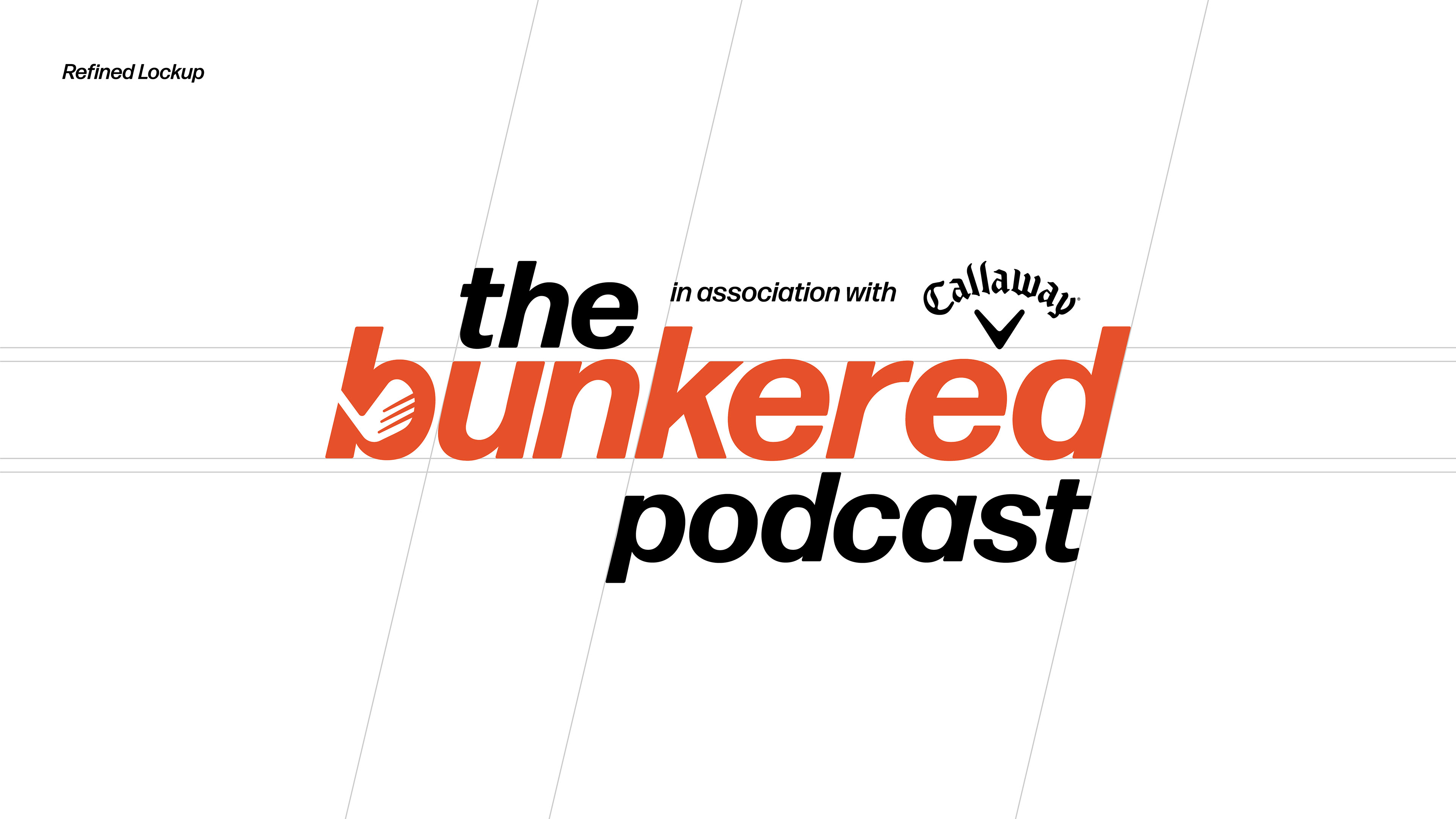
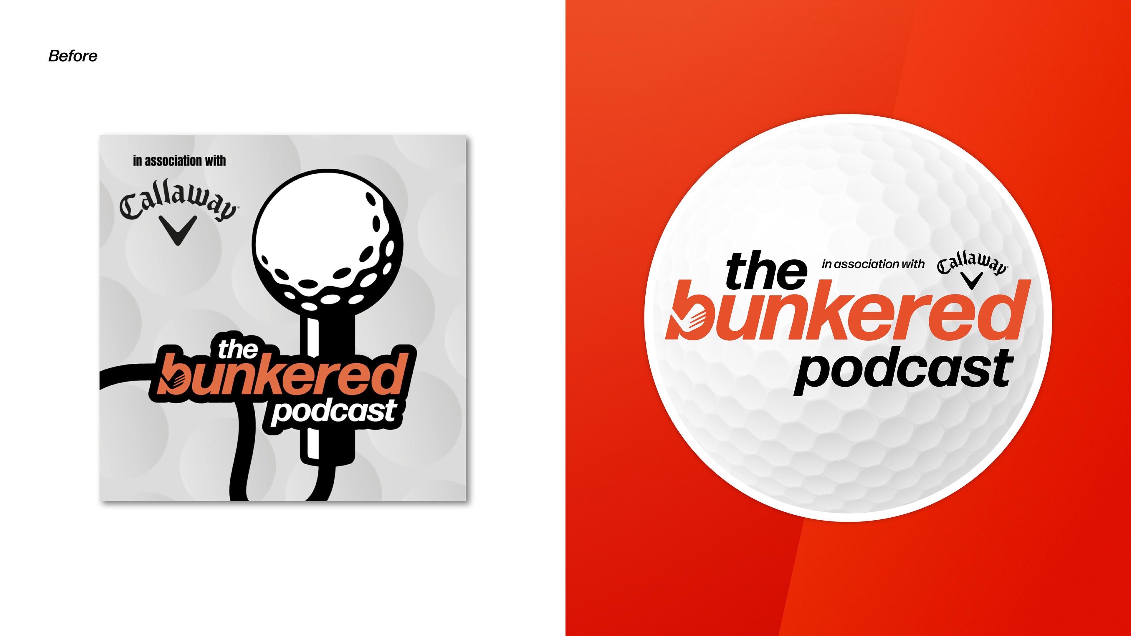
The previous logo used a heavy outline and had an uneven layout. Its main colours were grey, black and white, while the orange was used sparingly.
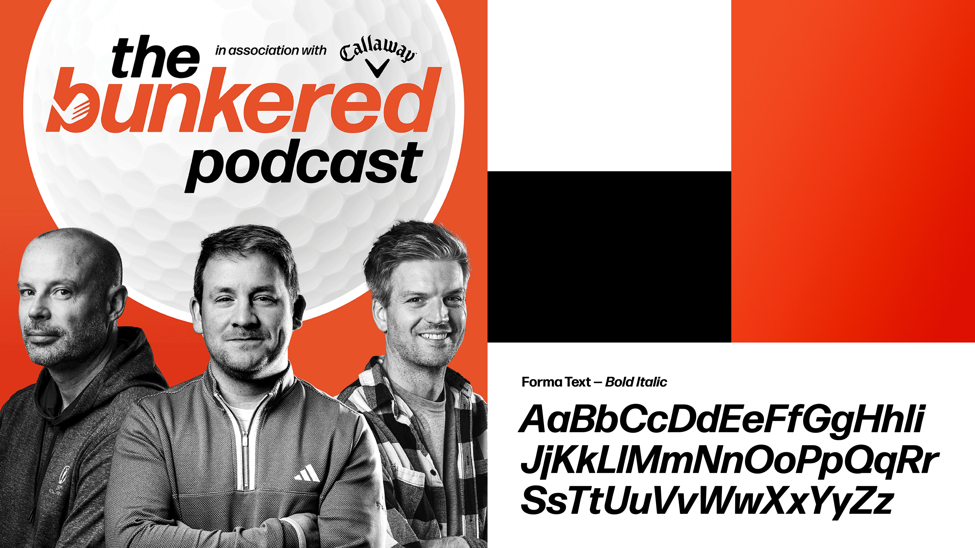
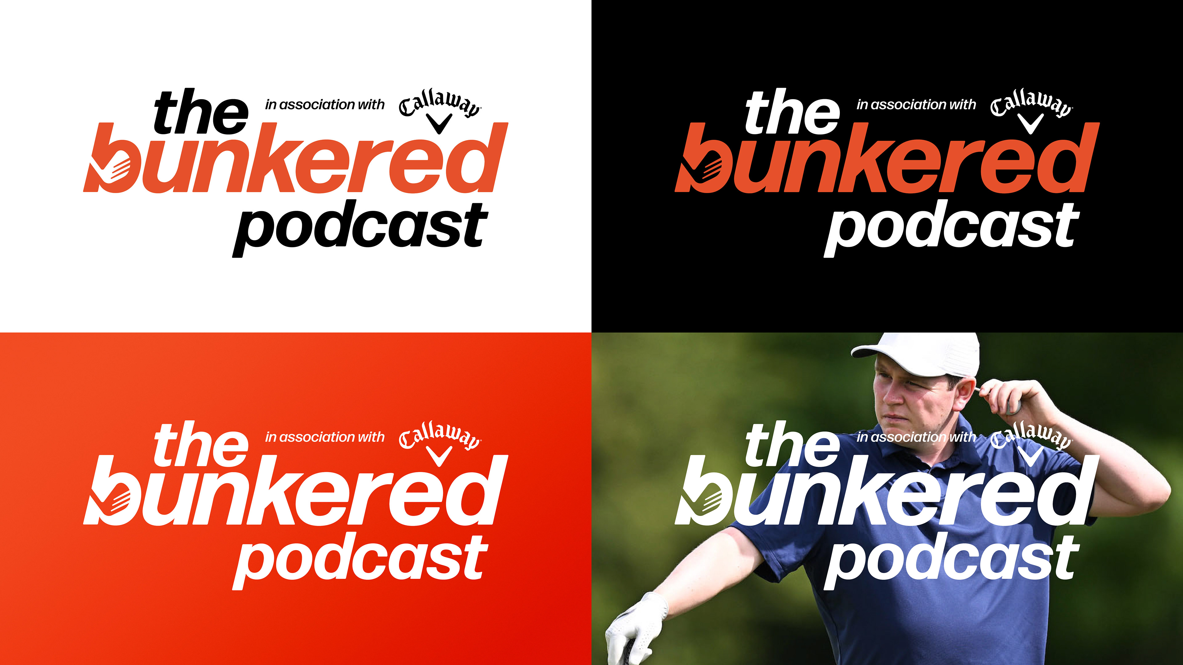
I removed the outline, creating more alignment in the lockup and used it centrally with the golf ball graphic in the background. To add further depth to the visual language, I leaned into the angle of the logotype to provide a graphic device.
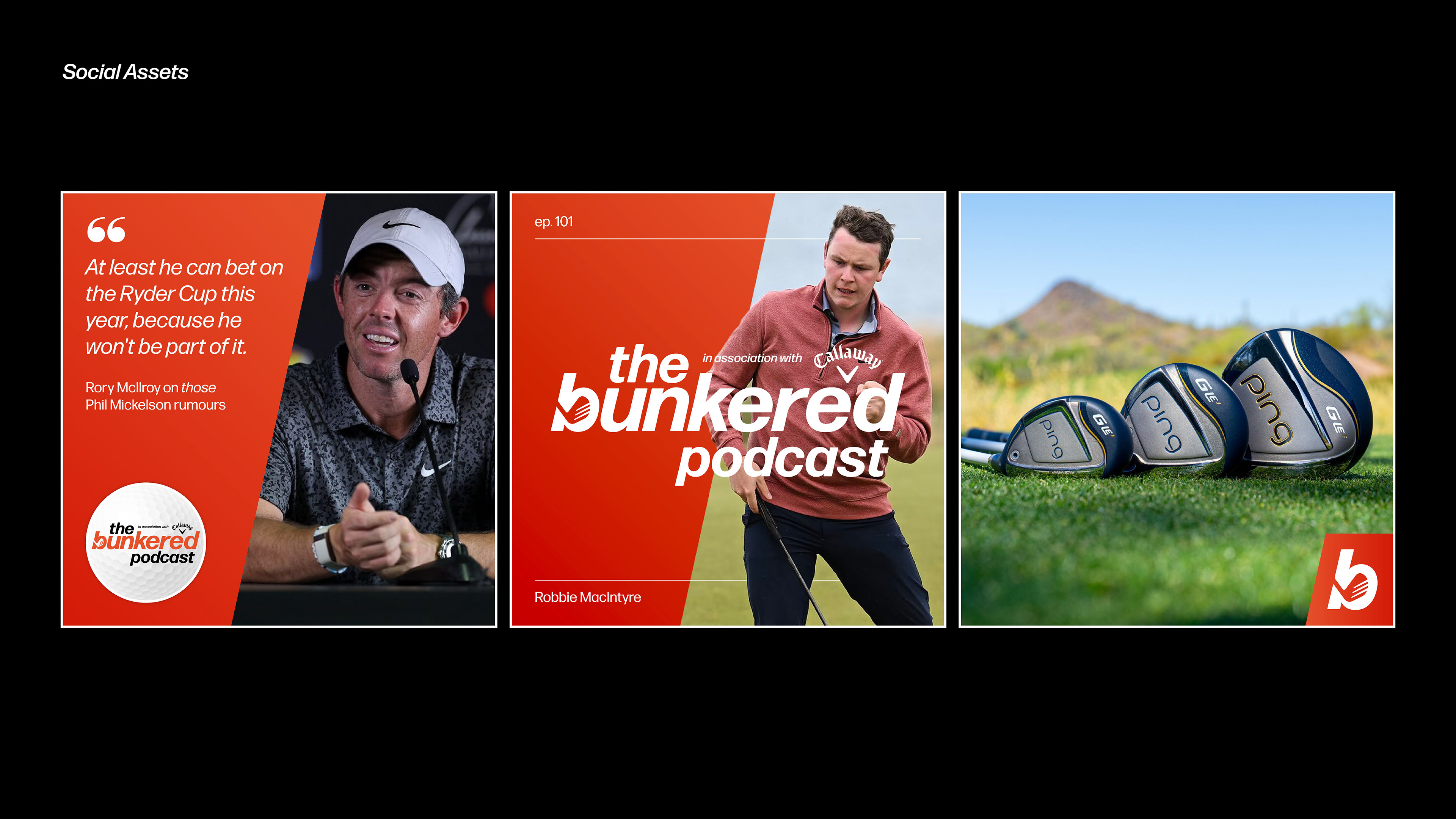
The golf podcast landscape is dominated with green and black covers – I saw this as an opportunity to create stand out by dialling up the Bunkered orange, allowing high contrast alongside the black and white.
I removed the outline, creating more alignment in the lockup and used it centrally with the golf ball graphic in the background. To add further depth to the visual language, I leaned into the angle of the logotype to provide a graphic device.
The golf podcast landscape is dominated with green and black covers – I saw this as an opportunity to create stand out by dialling up the Bunkered orange, allowing high contrast alongside the black and white.