Speyside Capital
Brand Refresh, Guidelines, Rollout
Brand Refresh, Guidelines, Rollout
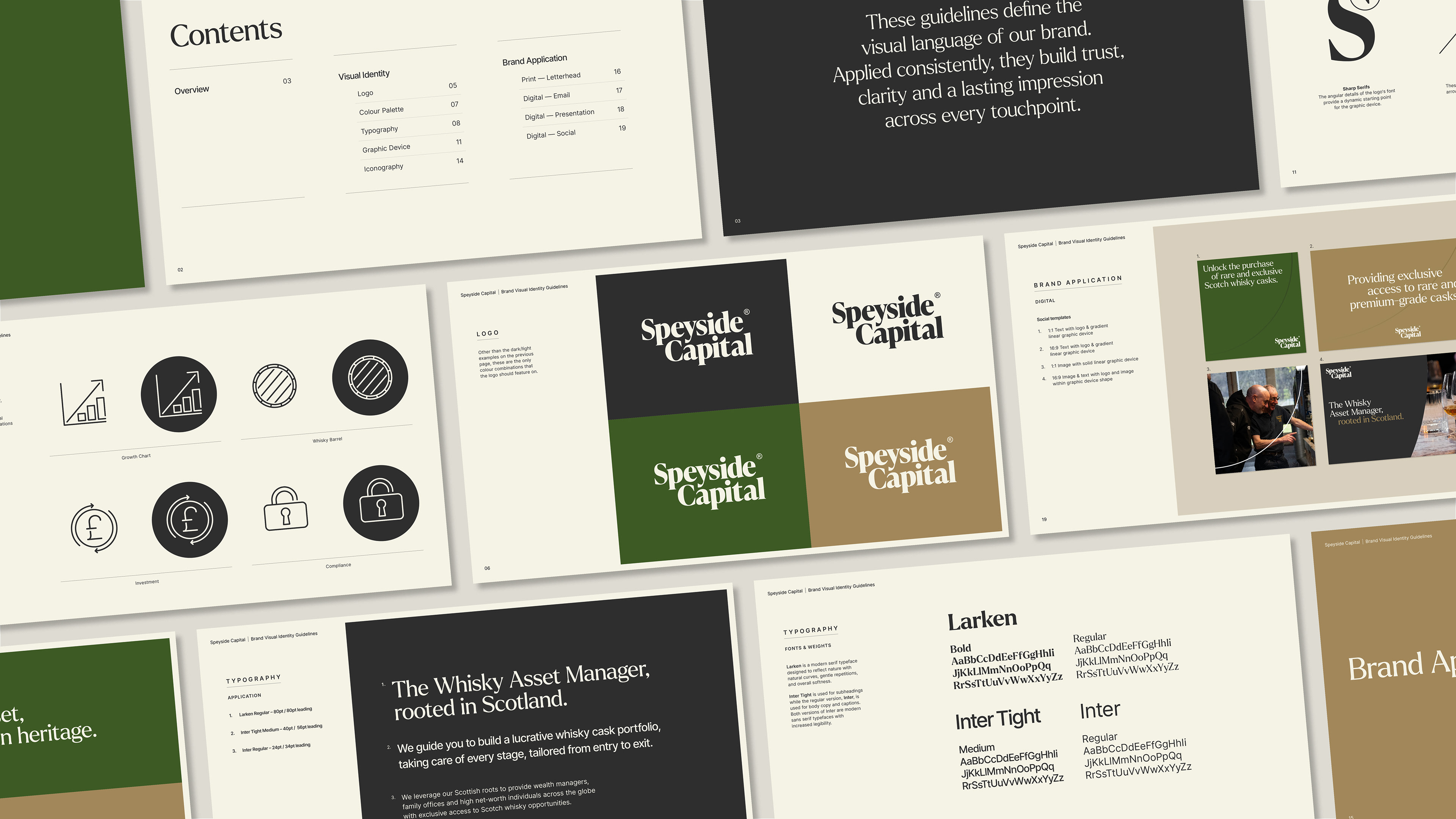
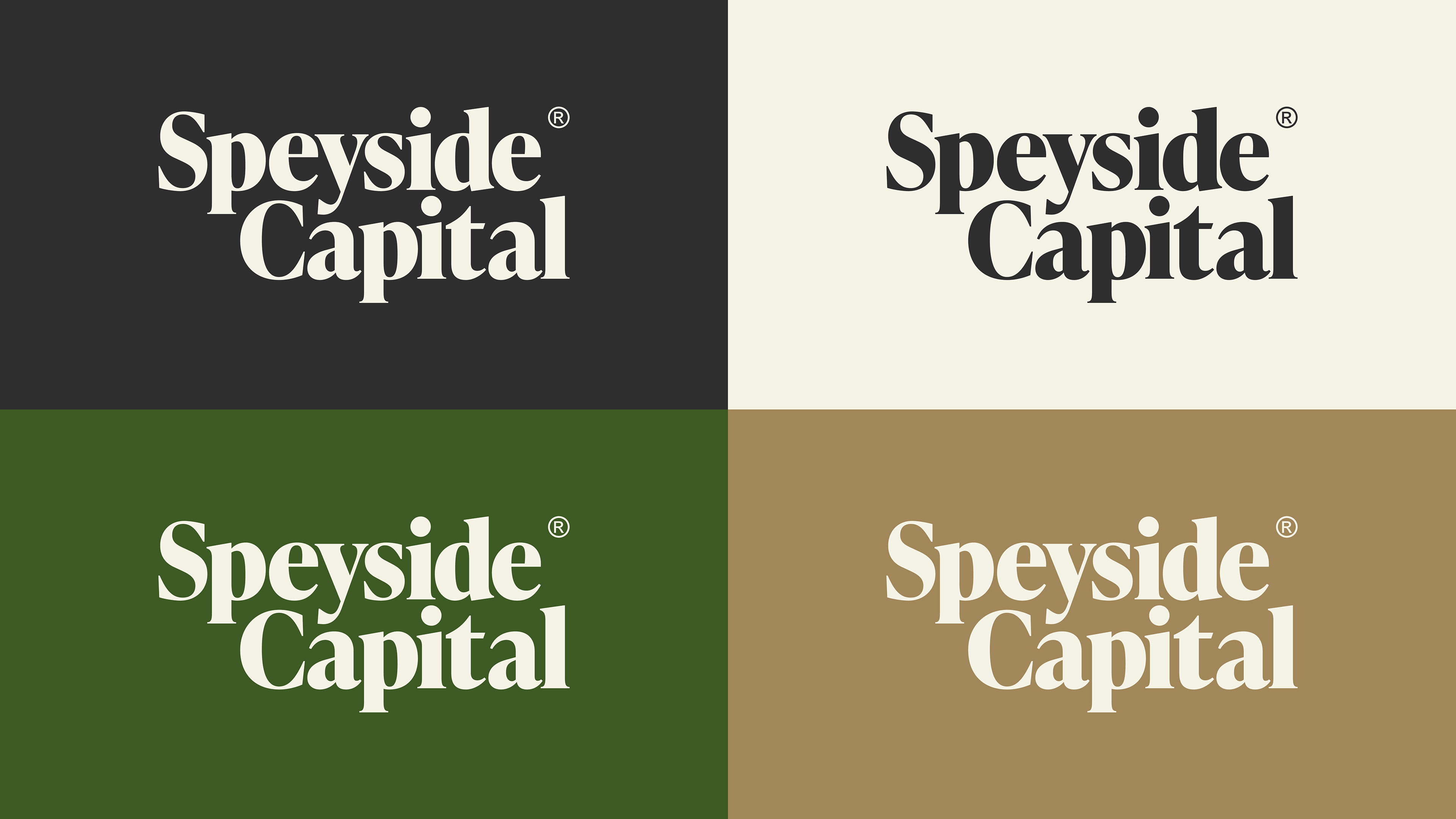
Speyside Capital approached me to help refine their visual identity including their logo, colours and typography.
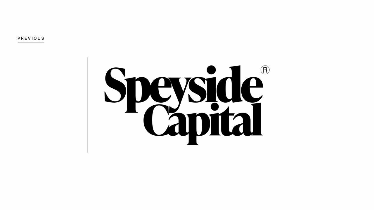
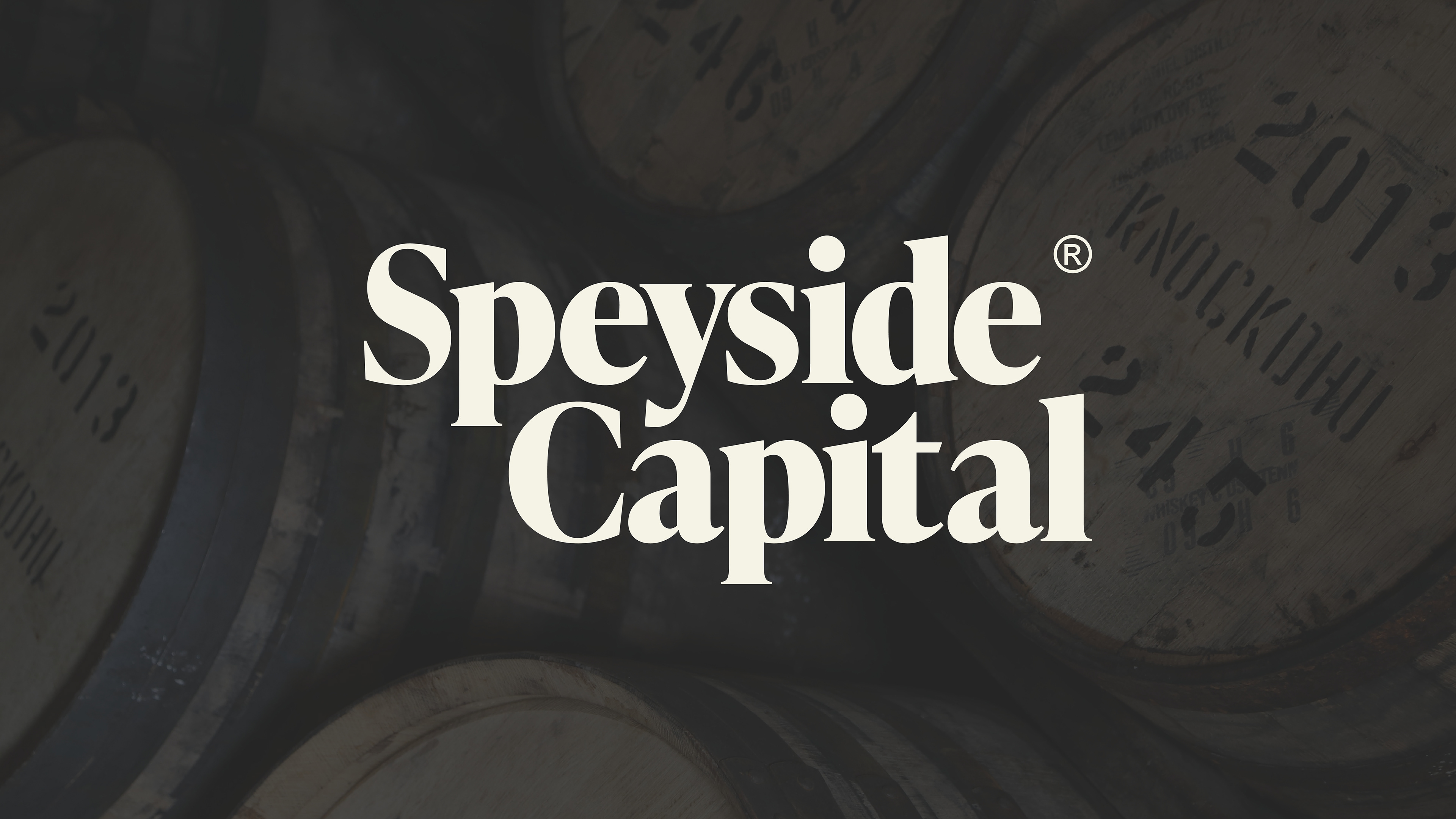
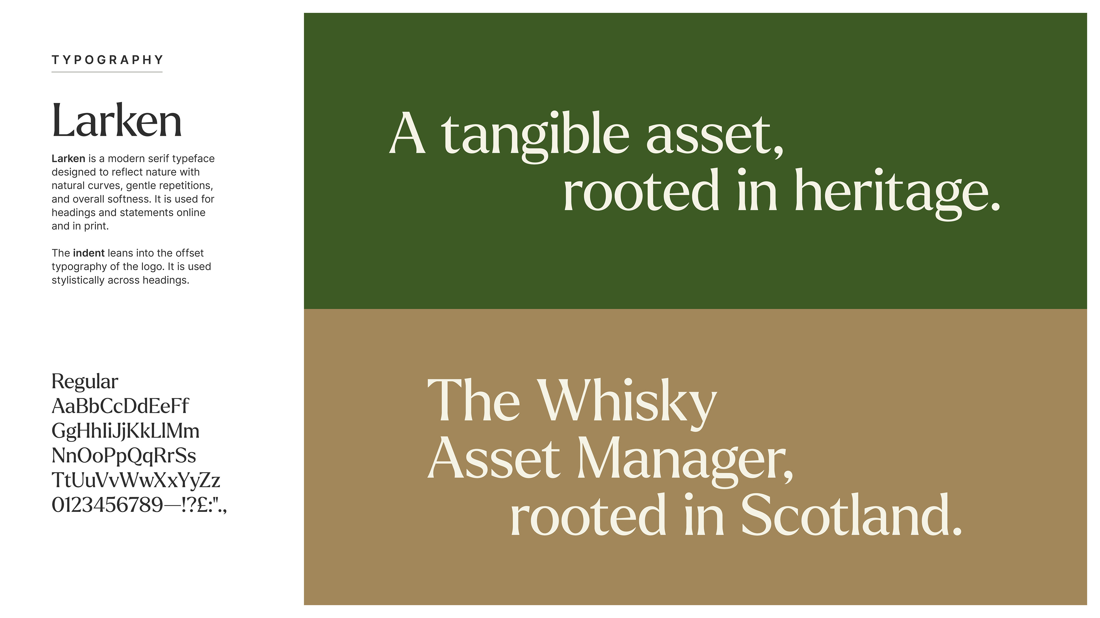
I simplified the logo, making it more consistent and usable at smaller sizes. I tweaked their existing colour palette, selecting four colours that blend vibrancy and elegance. I also introduced a more modern font pairing.
I simplified the logo, making it more consistent and usable at smaller sizes. I tweaked their existing colour palette, selecting four colours that blend vibrancy and elegance. I also introduced a more modern font pairing.
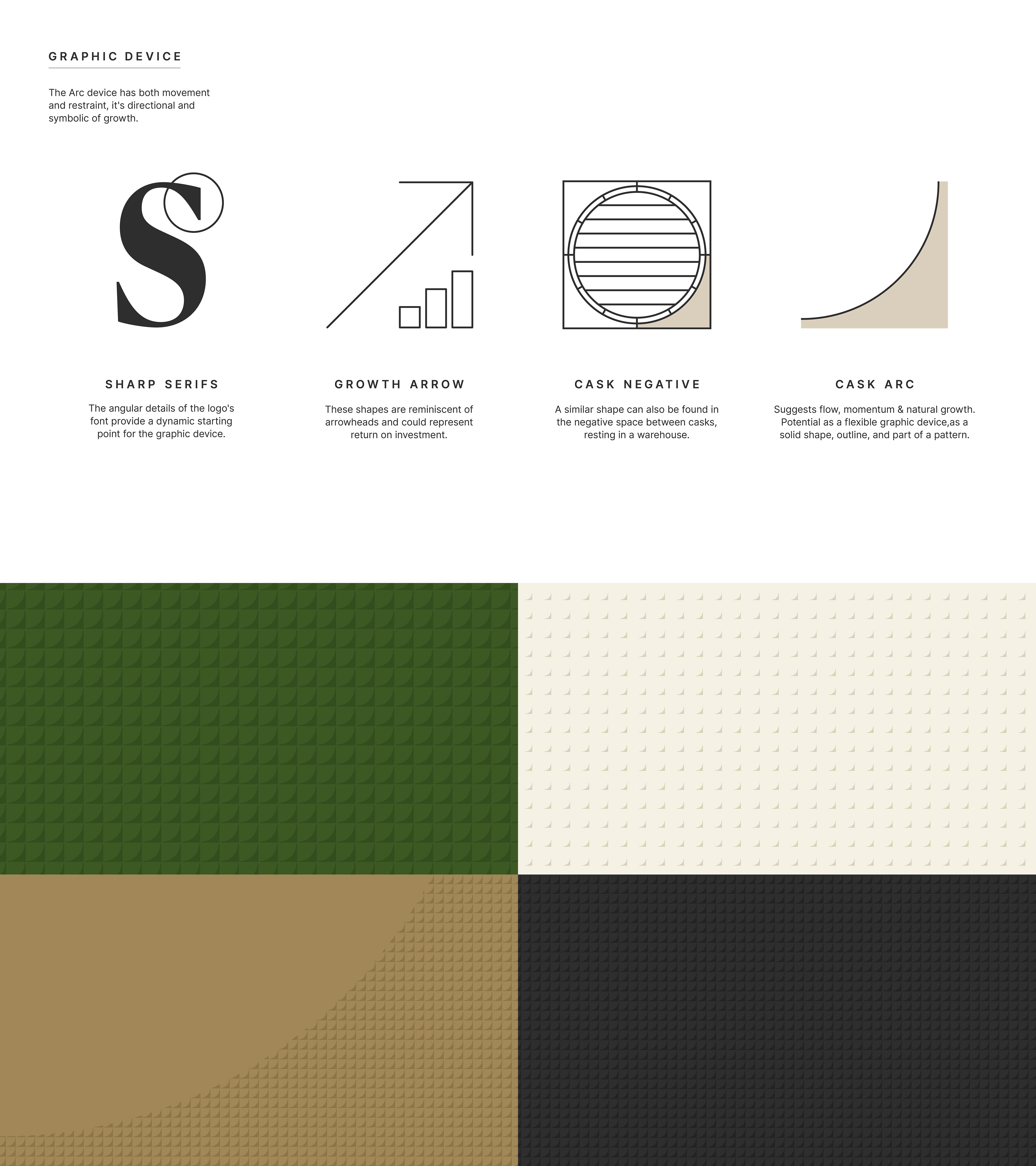
Graphic Device & Iconography

Brand Application & Guidelines